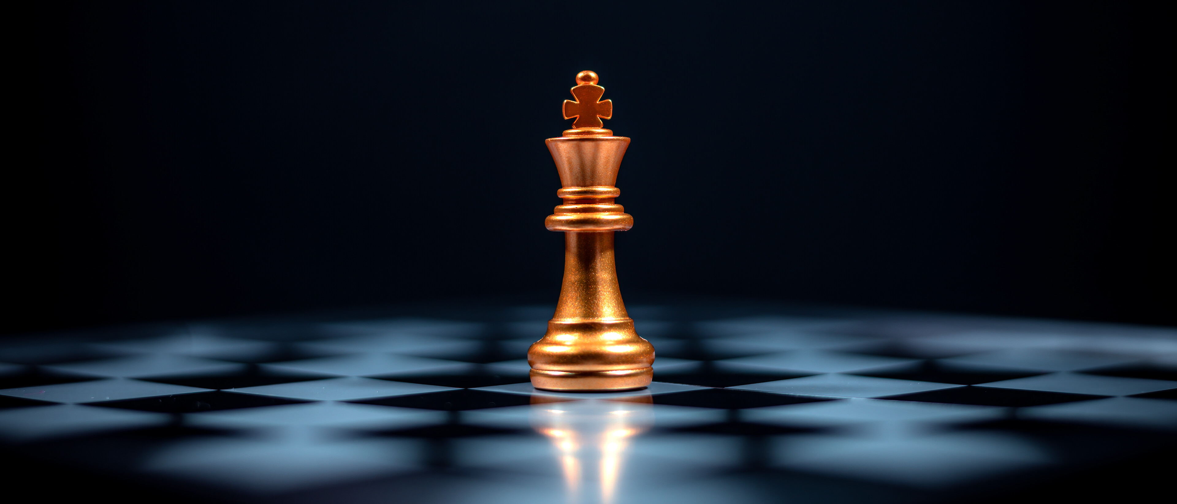
The most foundational of all design principles, contrast, facilitates our perception and understanding of content.
But what exactly is contrast, and why is it so vital to effective design?
Contrast refers to the juxtaposition of elements in a composition. Areas of contrast may include:
• Value (light vs. dark)
• Hue (complementary colors)
• Size (large vs. small)
• Shape (geometric vs. organic)
• Texture (smooth vs. rough)
• Font weight (bold vs. regular)
Contrast adds visual interest and makes elements distinguishable from one another. Without it, visuals would appear flat, confusing, and uninspiring.
What contrast does for us
1-Creates aesthetic appeal
Designers use contrast to create dynamic, engaging visuals that keep viewers’ attention. Contrasting colors, bold typographic pairings, and combinations of shapes and textures bring life and energy to a design.
Lack of contrast is an equally powerful design technique. If we want to create a calm, pensive or soothing atmosphere, a low contrast composition will support this kind of quiet mood.
2-Establishes visual hierarchy
Contrast helps prioritize the most important parts—whether it’s a call-to-action button, a product image, or a headline. By making these elements strong focal points, we guide the viewer’s eye to where we want their attention. Smart use of contrast controls the flow of information and determines what will be seen and read first.
3-Improves legibility
One of the most practical uses of contrast is ensuring that text is readable. Dark text on a light background improves legibility and reduces strain on the eyes. Poor contrast, like light grey text on a white background, can make content difficult to read — especially for those users who may have difficulty reading to begin with.
Accessible design is inclusive. High-contrast interfaces are much easier for users with visual impairments to interact with. Following WCAG (Web Content Accessibility Guidelines) standards for contrast ensures that your digital content is usable for a broader audience — a critical responsibility for designers.
How the human eye detects contrast
The human eye is highly sensitive to contrast—more so than to color or brightness alone. Contrast enables us to detect edges, shapes, and depth.
Retinal processing
At the retina (the light-sensitive layer at the back of the eye), we have photoreceptor cells—rods and cones:
- Rods (used in low light) are particularly sensitive to light-dark contrast but not to color.
- Cones (used in daylight) detect color but still rely on contrast to define shapes and edges.
Why artists squint
Squinting slightly changes the shape of the eye, increasing depth of field and sharpening the image. Only the dominant shapes and tones remain visible.
As a result, fine detail is reduced, but major forms and contrast zones become clearer. This is especially helpful in design work or art critique to quickly evaluate the balance of light vs. dark.
Edge detection and lateral inhibition
Your retina processes contrast by amplifying differences between adjacent areas—a phenomenon known as lateral inhibition. This helps you see edges and outlines more sharply, even when colors are similar.
Sharpening tools used in cameras and image editing software depend on this phenomenon. Focus can’t be brought into an image that is out of focus to begin with. But sharpening tools detect areas of contrast and enhance the differences between them, giving the illusion of sharper focus.
(Click the images to enlarge them.)
How the brain interprets contrast
Visual cortex processing
Information is sent from the eyes to the visual cortex in the brain, where patterns of contrast are decoded to identify objects, motion, depth, and importance. The brain prioritizes high-contrast areas, interpreting them as more important or relevant.
Figure-ground relationship
The brain uses contrast to distinguish between the “figure” (subject) and the “ground” (background). If there’s not enough contrast, the viewer may struggle to separate these elements, causing visual confusion. This principle is easily demonstrated by the “remove background” command in your smartphone camera or image editing software.
Emotional and cognitive impact
Contrast isn’t just visual—it can create emotional tension. For example:
- Dark vs. light can symbolize good vs. evil.
- Sharp vs. soft can suggest danger vs. calm.
These interpretations are processed subconsciously, influencing perception and behavior without the viewer realizing it.
The human brain is wired to seek contrast—it’s how we make sense of the world.
Whether it’s visual, emotional, or conceptual, using contrast effectively taps into this deeply rooted perceptual mechanism.
Contrast — the power behind good content
More than just a design principle, contrast is a strategic tool that impacts the way our audience sees, feels, and responds. It guides the eye, strengthens focus, and ensures our message cuts through the noise. By understanding how contrast influences perception and behavior, we can give your campaigns greater impact. It’s not just about making things pretty—it’s about making them work. Contrast will get your message seen, remembered, and acted upon.


