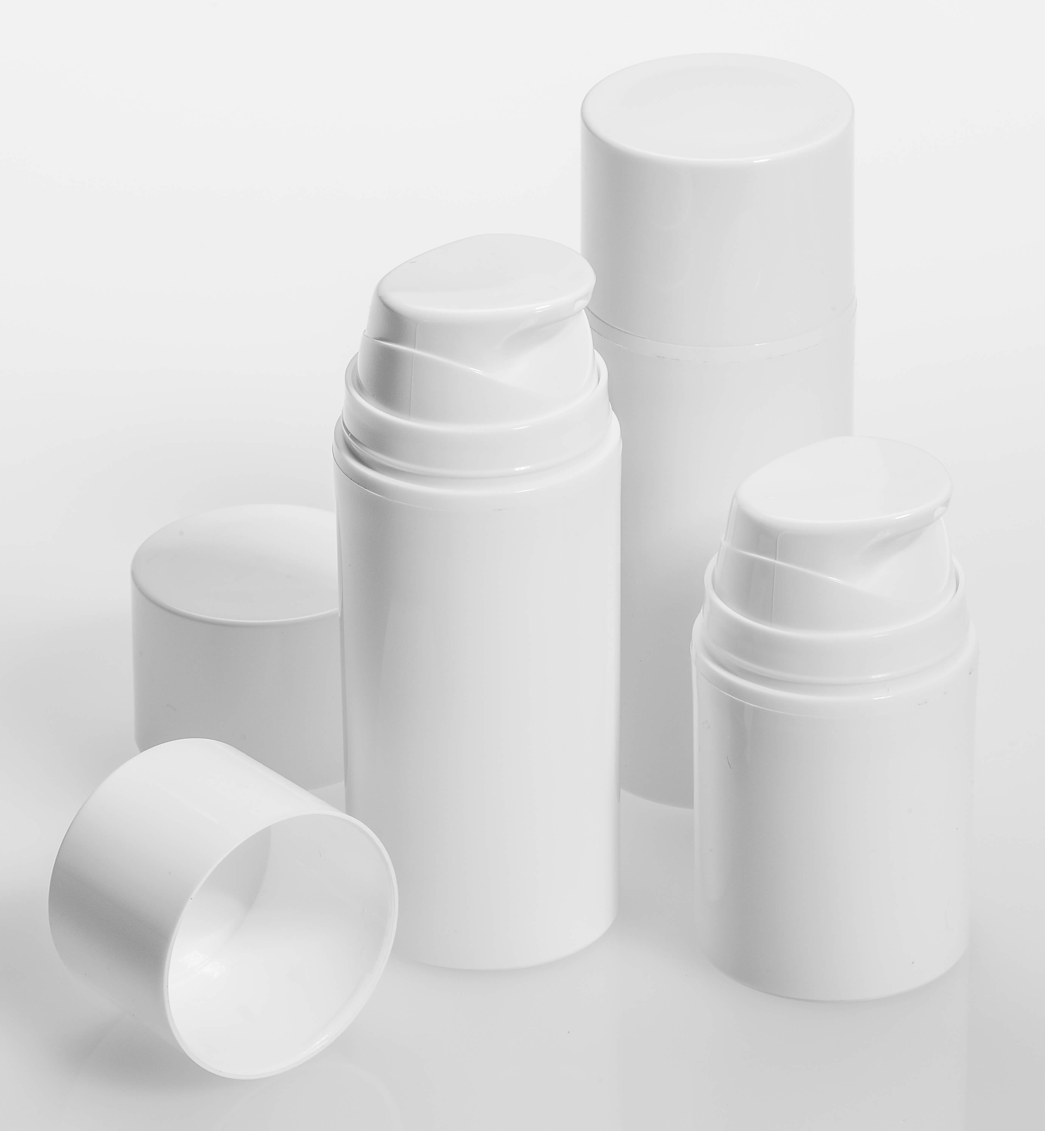
We’ve already explored how contrast creates aesthetic appeal, establishes visual hierarchy, and improves legibility. It’s also essential in describing form.
Perhaps it’s more accurate to say that light and shadow describe form. A flat black shape against a flat white shape will provide plenty of contrast, and one plane may appear to be in front of or behind another, but the perception of physical volume does not emerge until gradients are introduced.
It’s all about the way light wraps around an object. Angular or textured objects will have areas of sharp contrast, particularly at edges or corners, while rounded objects tend to allow the light to create a full range of graduated values on their surfaces.
Orchestrating light and shadow
When an image is created, an artist or photographer will first consider the primary light source. This may come from the physical environment surrounding an object — like a sunlit window or a lamp — or it may be arbitrary, like a light source chosen in a 3D rendering program. The more singular and directional the primary light source, the more limited a description of the forms it will create.
In order to fully describe all the surfaces of a form, secondary light sources are often added. These may be reflections of the primary light source, or additional light sources coming from opposing angles that help our eyes interpret what’s going on in the shadows created by the primary light source. Any light sources that are added must be subordinate to the primary light source, or they will confuse rather than illuminate the form.
Our expectations are based on the way we experience our environment
In nature, our primary light source is the sun. Subject to gravity, people and objects tend to be anchored to the earth. On this base surface, shadows are cast. Though we are often completely oblivious to shadows in nature, they do a great deal to describe the form as well.
This information is not inherent in the shadow, which tends to be monochromatic and flat. Subconsciously, we interpret cues from the shadow. What does the size and shape of a shadow say about the object? How dark is the shadow, and how much does it contrast with its background? How is it anchored to the object that creates it? There’s enough to talk about here for an entirely separate article.

But because the earth and sun create our natural environment, we generally expect our primary light source to be from above, and subconsciously or otherwise, we expect shadows to be underneath objects on a base plane. Following these norms will help viewers orient the objects portrayed. Flipping these norms will create disorientation. Think Dad on Halloween, showing his face in the window illuminated by a flashlight below his chin.
Intellectual and emotional effects of light and shadow

The images below were shot by photographer Jim Lennon. Also known for his brilliant location work, in the studio Jim commands light and shadow to describe form and evoke mood.
Low key images, in which values are overwhelmingly dark, tend to draw viewers into the image and create a sensation of depth and weight. If the primary light source is monodirectional and focused, the edges the light touches will be accentuated, creating linear effects, while areas of shadow will recede into the background. The addition of secondary light sources will “fill in” the shadows and provide more information about volume, as well as surface detail. Skilled use of the low key palette to create the illusion of depth and weight is known as chiaroscuro. Caravaggio made this technique famous, using it to evoke the drama of human tragedy.
A high key palette, in which values are predominantly light, creates a sensation of open airiness and bouyancy. In this range, subtle, understated shading goes a long way to describe form. In a high key image, the introduction of very dark shadows violates the weightlessness and creates the illusion of a hole or void in the image. So we may not see as wide a range of light to dark in high key images compared to low key images. Monet and the Impressionists are masters of the high key palette.
A full range of light and dark tones and gradients provides maximum information—more cues than we would have time to pick up in our day-to-day journey from one visual experience to another—enticing the viewer to look further, and spend a little more time, to take it all in.
Using contrast to inform, inspire and influence
Understanding the power of these volumetric and spatial cues empowers us to describe a face, an object, or a place. It also allows us to manipulate the mood, the amount of information given and the time it takes our viewers to fully read it.